

Flutter Tips: Connect Two PageView Widgets for Navigation


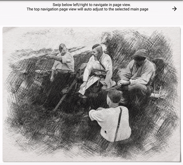
For my game app I decided to have a custom PageView navigation. It has an independent scrolled navigation bar connected to the main scrollable content area. It looks like this:
TLDR. You can try it online and check the source code here: dartpad.dev/000ccfee0d52ee6c684d75e7c4cd5271
Widget Breakdown
The PageView widgets can have multiple pages attached to it. It auto scrolls to them when user swipes left or right on the screen. More info about this widget can be found on official youtube channel: youtube.com/watch?v=J1gE9xvph-A&feature..
Before starting creating the layout of the widgets, I usually create the smallest possible Widget API which can satisfy my needs:
- Buttons to go left/right
- Main Content views can be any widgets
- Navigation views can be any widgets
- List size of navigation and main content widgets must be identical
This can be achieved by having only two collections as the input properties for the new Widget:
LinkedPageViews(
            mainViews: [
             // widgets for main content
            ],
            titles: [
            // widgets for title content
             ],

          )
This is an absolute minimum I would like to provide the new widget in order to get the required look and functionality.
Creating layout
Now let's implement layout of the LinkedPageViews widget.
The root widget of it will be Column , as the navigation bar and main content are located one under the other:
Column(
  crossAxisAlignment: CrossAxisAlignment.stretch,
  children: [
     // navigation,
     // main content
  ]
);
Main Content PageView
We use PageView.builder to create a scrollable and swipable main content area and pass there our widgets:
 Expanded(
          flex: 9,
          child: PageView.builder(
            controller: _mainPageController,
            scrollDirection: Axis.horizontal,
            itemCount: widget.mainViews.length,
            itemBuilder: (context, index) {
              return widget.mainViews[index];
            },
          ),
        )
Expanded with flex property is used to tell how much of available screen should be taken by the child. As this is the main content area, we give it 9 (1 will be given to navigation area). So, it will occupy 90% of available space.
Navigation Content PageView
The title navigation is also a PageView but with disabled scroll (more on this later).
The render has couple of collection ifs : we have to avoid rendering 'go to' navigation buttons at first and last positions, as we cannot go to -1 or length + 1 widget. It would raise a runtime exception.
Expanded(
          flex: 1,
          child: PageView.builder(
            physics: NeverScrollableScrollPhysics(),
            controller: _topPageController,
            itemCount: widget.titles.length,
            itemBuilder: (context, index) {
              return Padding(
                padding: const EdgeInsets.all(8.0),
                child: Center(
                  child: Row(
                    mainAxisAlignment: MainAxisAlignment.spaceBetween,
                    children: <Widget>[
                      if (index != 0)
                        Container(
                          child: IconButton(
                            icon: Icon(Icons.arrow_back),
                            onPressed: () {
                              _goToPage(index - 1);
                            },
                          ),
                        ),
                      if (index == 0) SizedBox(width: 50),
                      widget.titles[index],
                      if (index != widget.titles.length - 1)
                        Container(
                          child: IconButton(
                            icon: Icon(Icons.arrow_forward),
                            onPressed: () {
                              _goToPage(index + 1);
                            },
                          ),
                        ),
                      if (index == widget.titles.length - 1)
                        SizedBox(width: 50),
                    ],
                  ),
                ),
              );
            },
          ),
        ),
_goToPage method is pretty simple. The code calls the same methods of both PageViewControllers to navigate to the specific page:
  _goToPage(int page) {
    _topPageController.animateToPage(page,
        duration: Duration(milliseconds: 150), curve: Curves.decelerate);
    _mainPageController.animateToPage(page,
        duration: Duration(milliseconds: 40), curve: Curves.decelerate);
  }
Connect PageViews!
PageView has a controller property . We can use it to react to user scroll actions and to give commands to the PageViews :)
At first, let's connect main content scroll event to the navigation PageView:
_onMainScroll() {
    _topPageController.animateTo(_mainPageController.offset,
        duration: Duration(milliseconds: 150), curve: Curves.decelerate);
  }
Now, every time the user scrolls the main content, the navigation PageView will also scroll but with a decelerate animation! You can play here with different Curves. There are a lot of predefined Curves already available for you!
The scrolling of the navigation PageView is disabled in order to avoid infinite callback loops:
physics: NeverScrollableScrollPhysics(),
To kick of controller listeners we override initState method and setup our controllers:
@override
  initState() {
    super.initState();

    _topPageController = PageController(initialPage: 0, viewportFraction: 1);
    _mainPageController = PageController(initialPage: 0)
      ..addListener(_onMainScroll);
  }
You can also dispose controllers in the dispose method of the Widget:
void dispose() {
  super.dispose();
  _topPageController.dispose();
  _mainPageController.dispose();
}
Summary
Flutter Widgets are highly composable. As you can see in this example, we created a new widget. It sets layout, adds specific local routing functionality and the Widget has no idea what it will render! It just inserts provided Main/Navigation Widgets and wraps them into its own layout. The end user has a complete freedom of what widgets to add to the main or navigation areas. It can be Text Widgets, Images, Buttons. It can be even another LinkedPageViews widget!
Real App Example
This specific navigation was required for my new city building app:
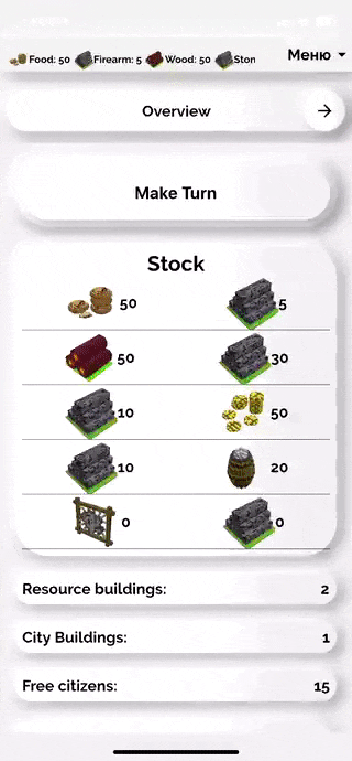
The full app is available for iOS, Android and Web: locadeserta.com/index_en.html
Homework
Add a new feature to the LinkedPageViews widget: left and right arrow buttons can be any widget, they have to be provided to the LinkedPageViews constructor. The navigation must still work when user presses on them!
LinkedPageViews(
            leftButton: ?,
            rightButton: ?,
            mainViews: [
             // widgets for main content
            ],
            titles: [
            // widgets for title content
             ],

          )
Hint
You can check my other article, where I implemented my own Scaffold widget in order to add expandable menu with custom actions:
gladimdim.org/flutter-creating-custom-scaff.. . Check the AppBarObject implementation and usage.